
Monday 10 February 2014
Tuesday 28 January 2014

Friday 24 January 2014

Monday 20 January 2014
Tuesday 14 January 2014

Tuesday 7 January 2014
Saturday 14 December 2013
Tuesday 10 December 2013

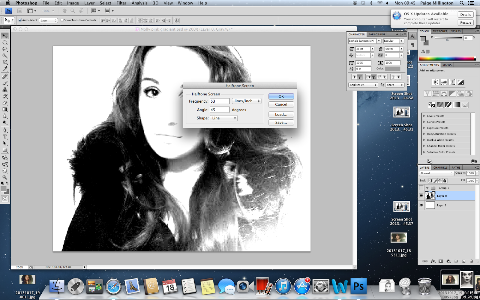
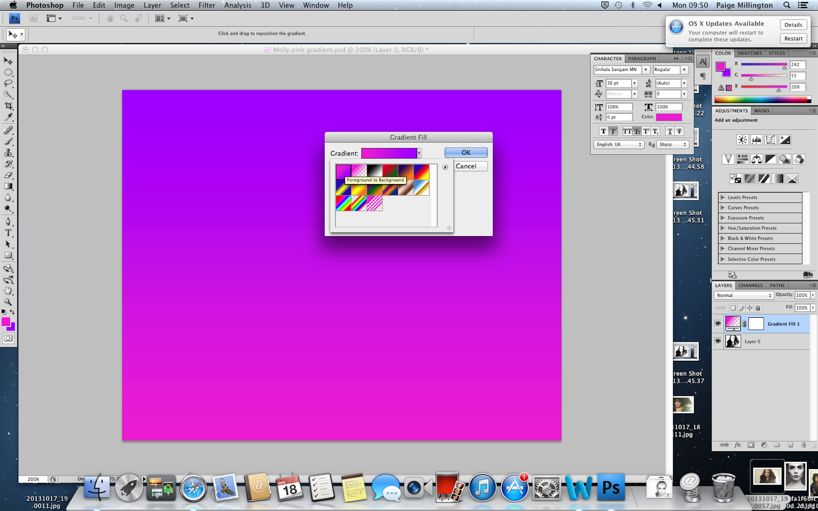
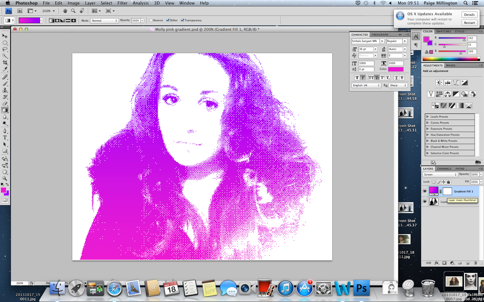
My experiment number2
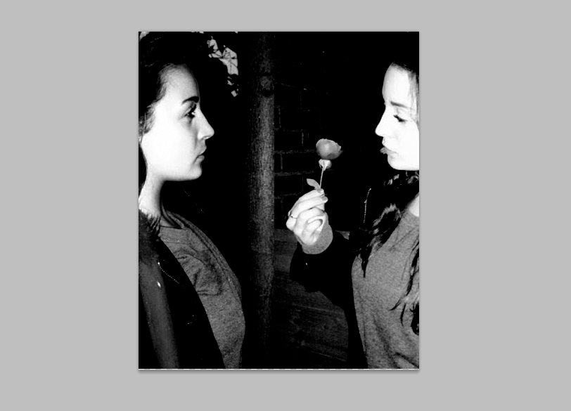 |
| This is two of my photographs i have put together, this gives the effect that she's looking at herself, this is like a mirrored effect i wanted. |
 |
| I then clicked on the circle tool and added a circle in a random position on my page. |
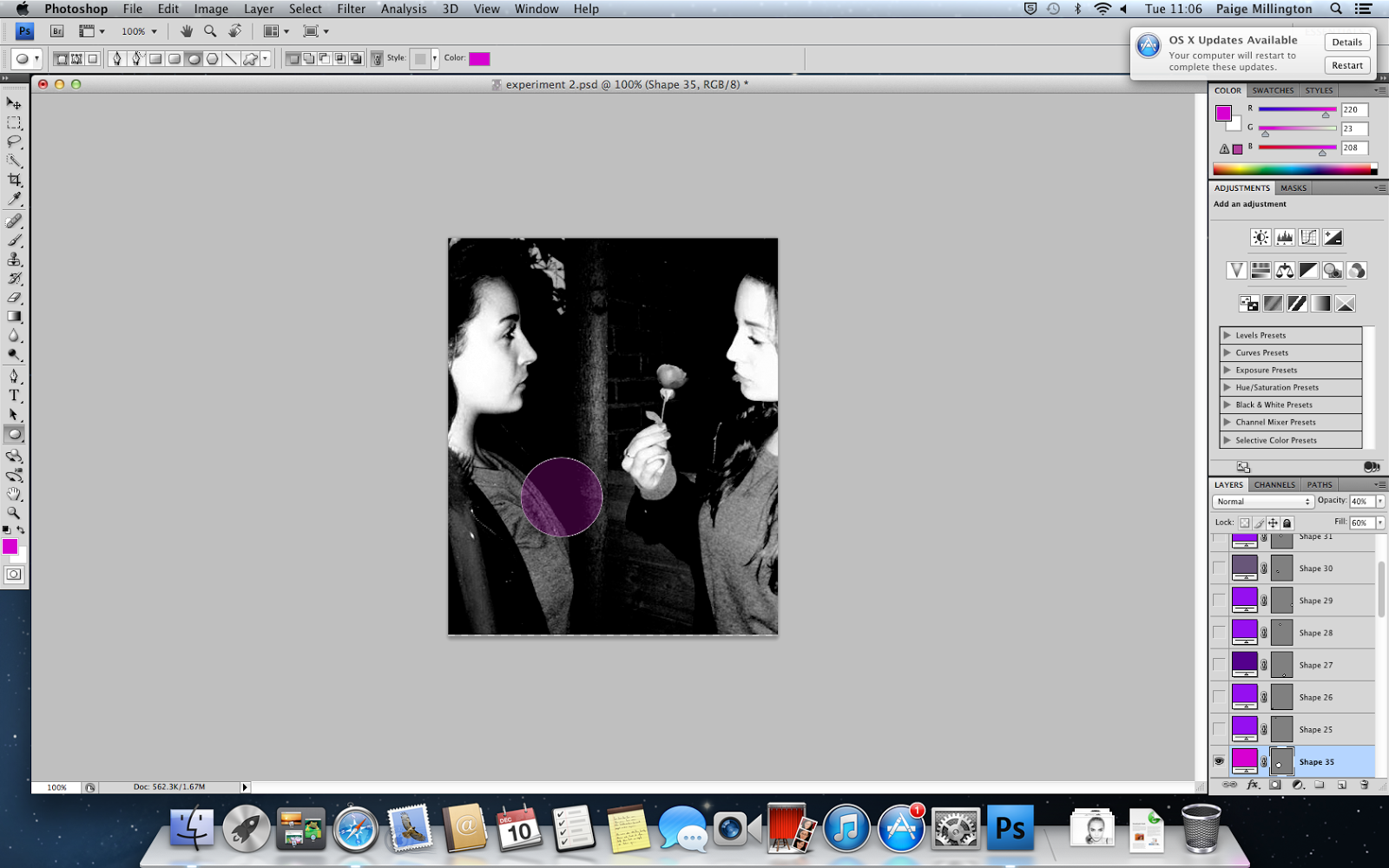 |
| I then chose the colour i wanted and filled the circle and changed the opacity. This gave this effect. |
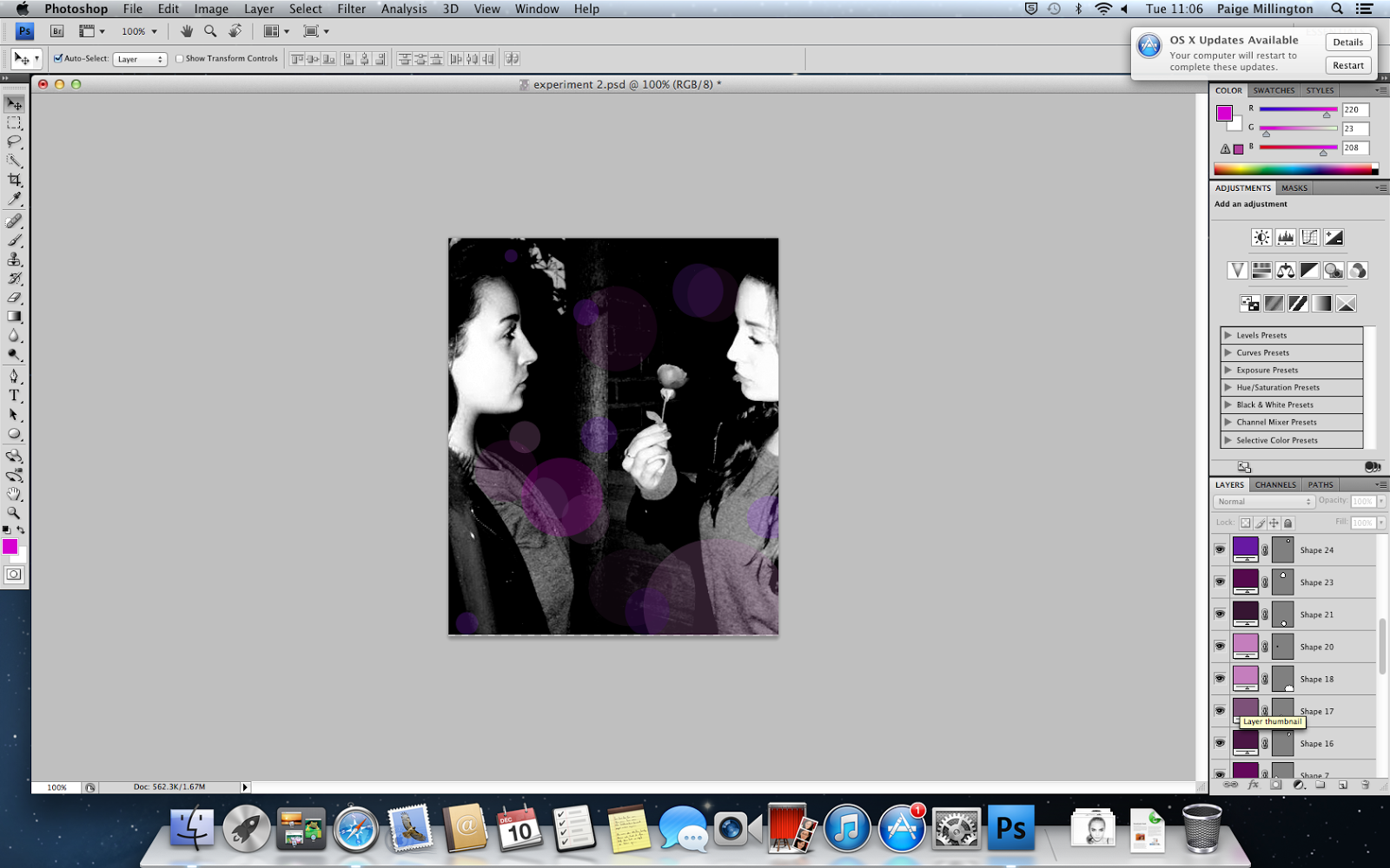 |
| Then i added more and more of these circles changing the size, colour and opacity. |
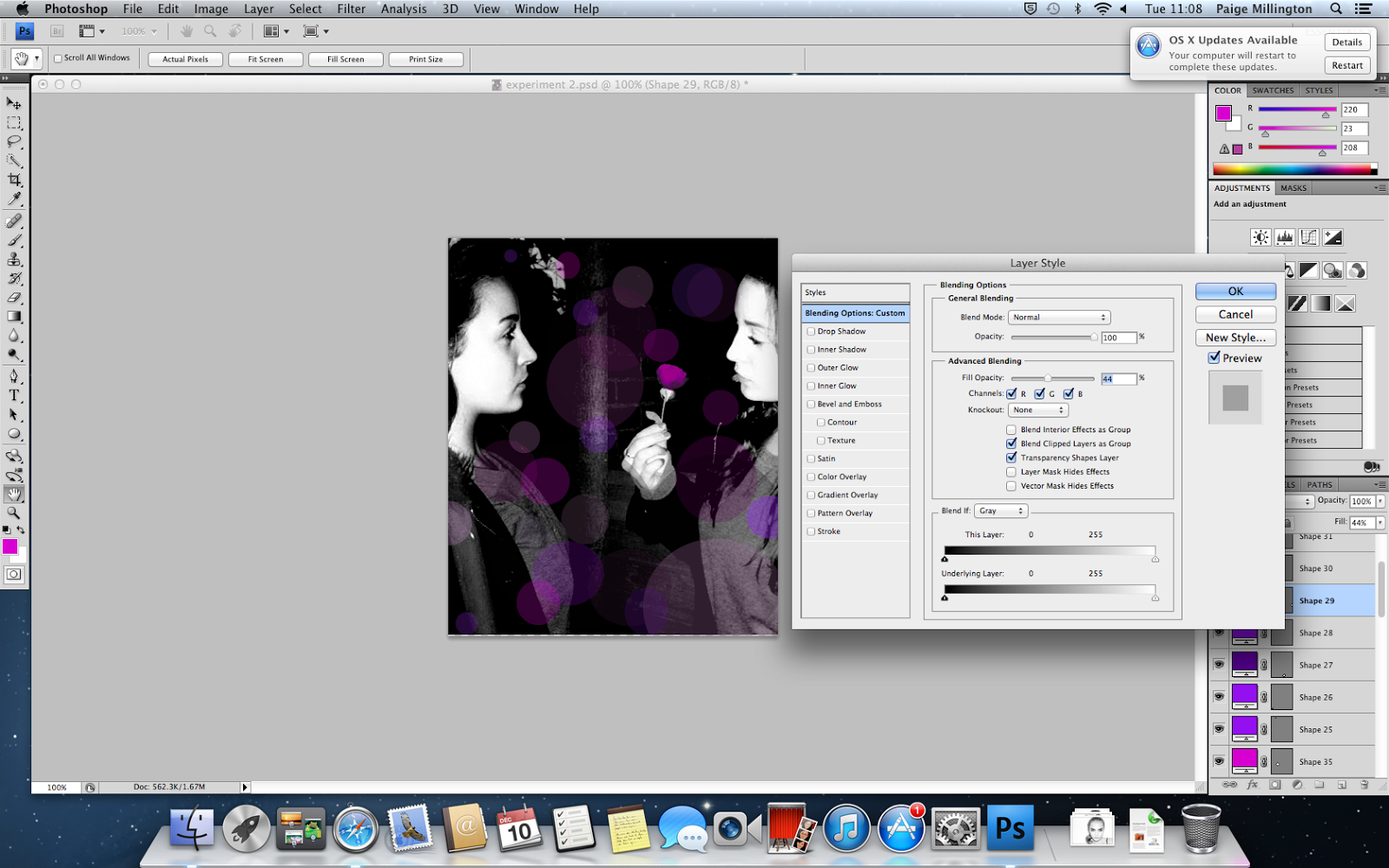 |
| This screenshot shows how i changed the opacity. |
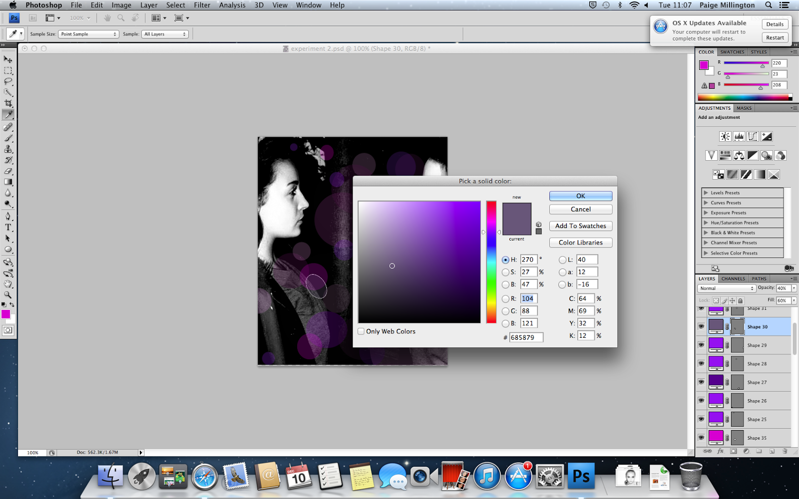 |
| This screenshot shows how i changed the colour. |
Monday 9 December 2013


Sunday 8 December 2013

Tuesday 3 December 2013
genre and design for music
Genre and Design for Music
(Delete this bit after reading - Research your own album covers and replace mine. Use may use different genres if you wish. Then complete the worksheet whilst looking at at range of album covers.)
Genre
|
Typical conventions
| |
 * * |
Jazz
|
The album of the jazz cover is very plain and simple, there is only shapes and is no photography, the blue lines look like they are done by using a highlighter which gives a unique effect. The background colour is very modern and effective towards the red and the blue.
The title name stands out against the red, this is because the colours are so opposite. The album cover has a lot of blank space so this shows that its not very busy, a disadvantage of this cover is that it it doesn't really stand out from the other cd covers.
|
 * * |
Blues
|
The Blues album cover is very chilled out, the colours are gold, black and white, this gives an elegant feel and it isn't too overcrowded. The album cover has very simple writing and just a photograph of a man holding a guitar, this is themed well as the photo is clearly linked to music as he is holding a musical instrument.The colours stand well against each other because they are so opposite and the gold on top of the black makes it stand out and look eye catching.
|
 * * |
Dance
|
This album cover is very modern and the colours are very young, the colours are bright and vibrant and make the cd cover stand out from the rest.
This cd is thought through well and the colours link well into the theme as they are very happy and lively.
The title of the album is very large and bold this draws the customers attention and there isn't too much going on which makes it look so much better as it isn’t too over crowded.
|
 * * |
Pop
|
This cd cover is very plain and quite boring but also has a great effect as the photograph is elegant and has a dramatic effect and really catches the eye, the photo is edited in black and white which gives a greater effect on her features. This cd cover has hardly anything going on and that makes it not too crowded which makes it easier to focus on her. The writing is large and this and her name is a different colour to the rest of the text which makes her name stand out more.
|
 * * |
Pop
|
This cd cover is very happy and has pale colours used, this gives a light and pretty cd cover to the eye. The photograph is of the band and is quite appealing as they all look good looking in the photo. The title is a dark colour which has a great effect against the paler colours that they’re wearing and that is on the background of the album. The album cover is quite simple yet has a lot of effect due to the photo and the type, this would catch the eye in the shop and therefor does its job. The cd cover could be improved by adding a bit more colour as the colours aren’t very bright which is usually associated with pop and young people.
|
 * * |
Rap
|
This cd cover has a very masculine colour scheme as its red,black and white, these colours are quite harsh and have great effect when are used together. This makes certain things on the cd cover stand out, e.g the rose on his shirt and his tie, One single red rose is usually used to represent death and rap songs are usually about death and violence, red is the colour that represents blood which both of these usually contain. The writing at the side also is very bold and stands out well against the black.
|
Sunday 1 December 2013

Tuesday 26 November 2013


Monday 25 November 2013
Thursday 24 October 2013
Tuesday 15 October 2013
my proposal
My Proposal
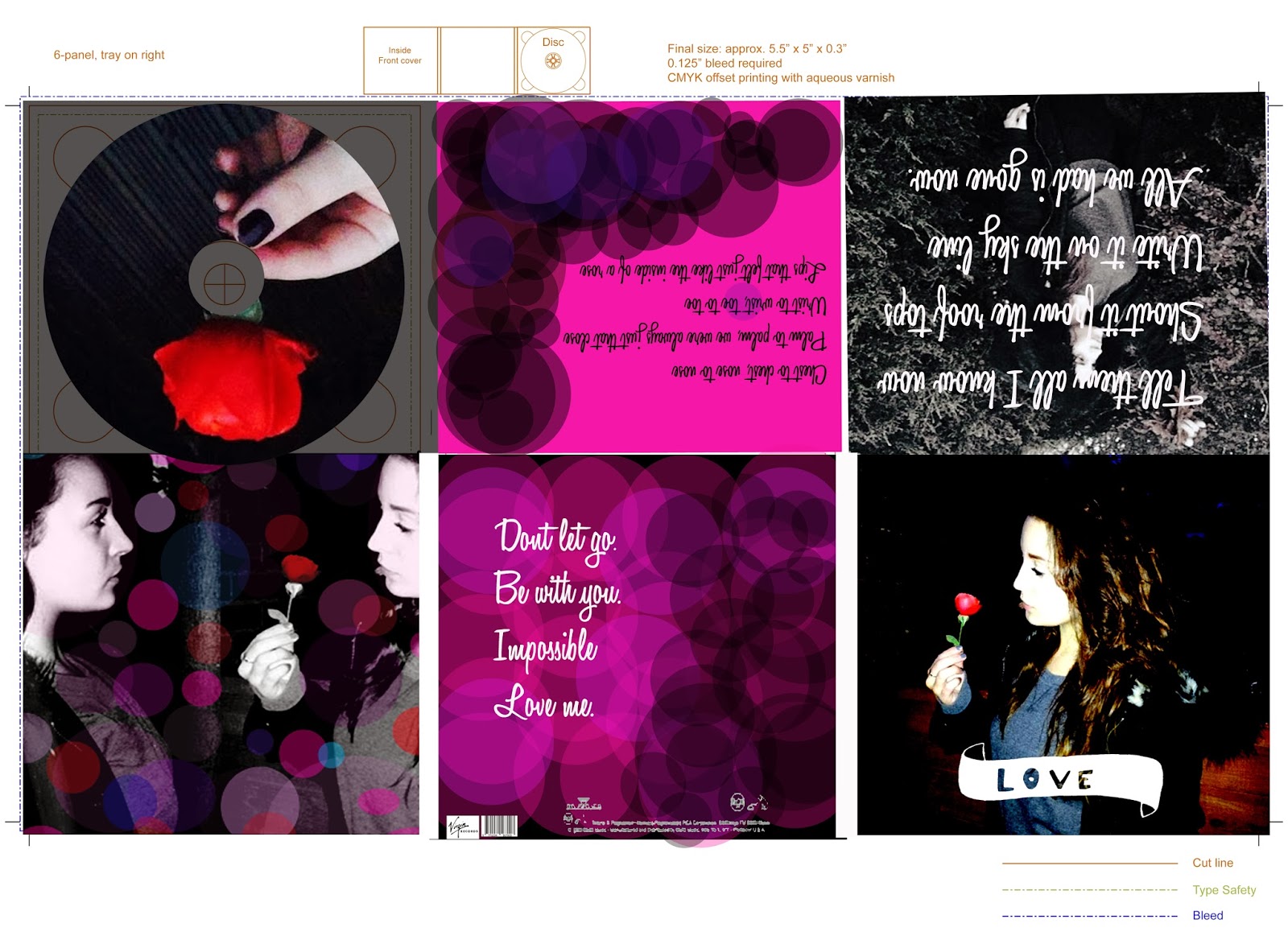
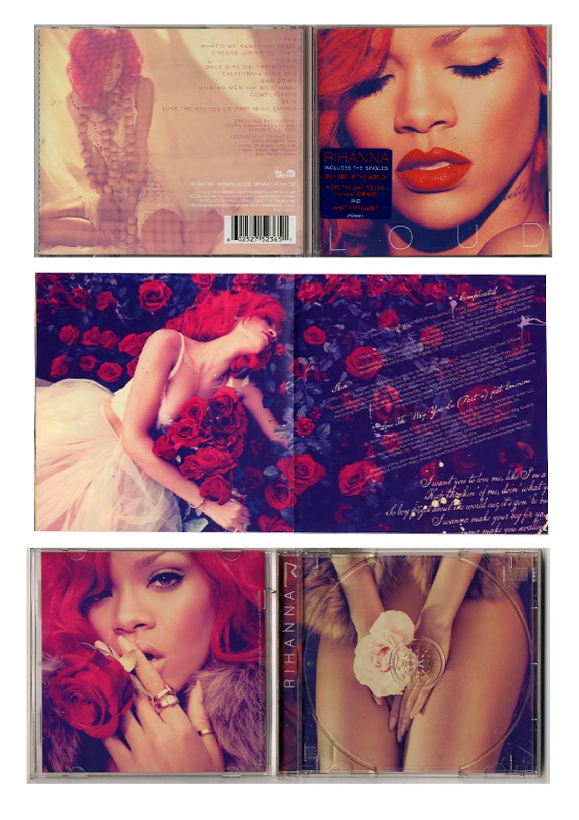
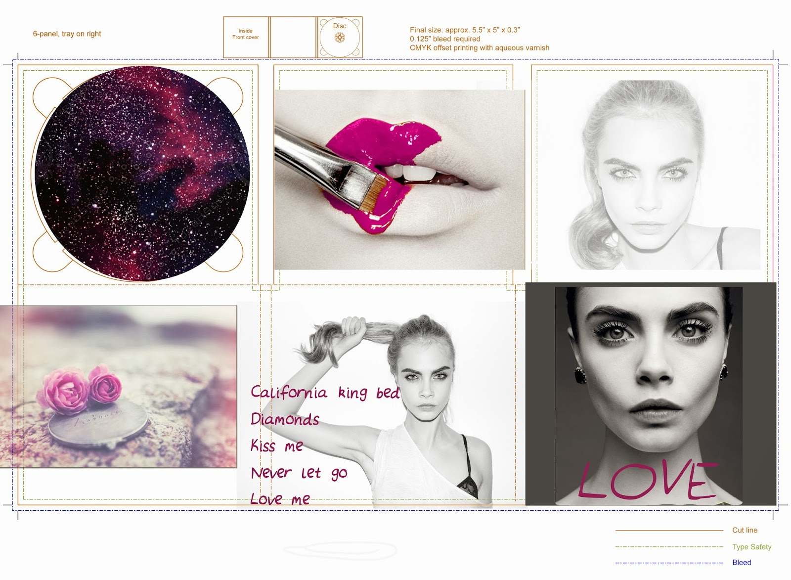
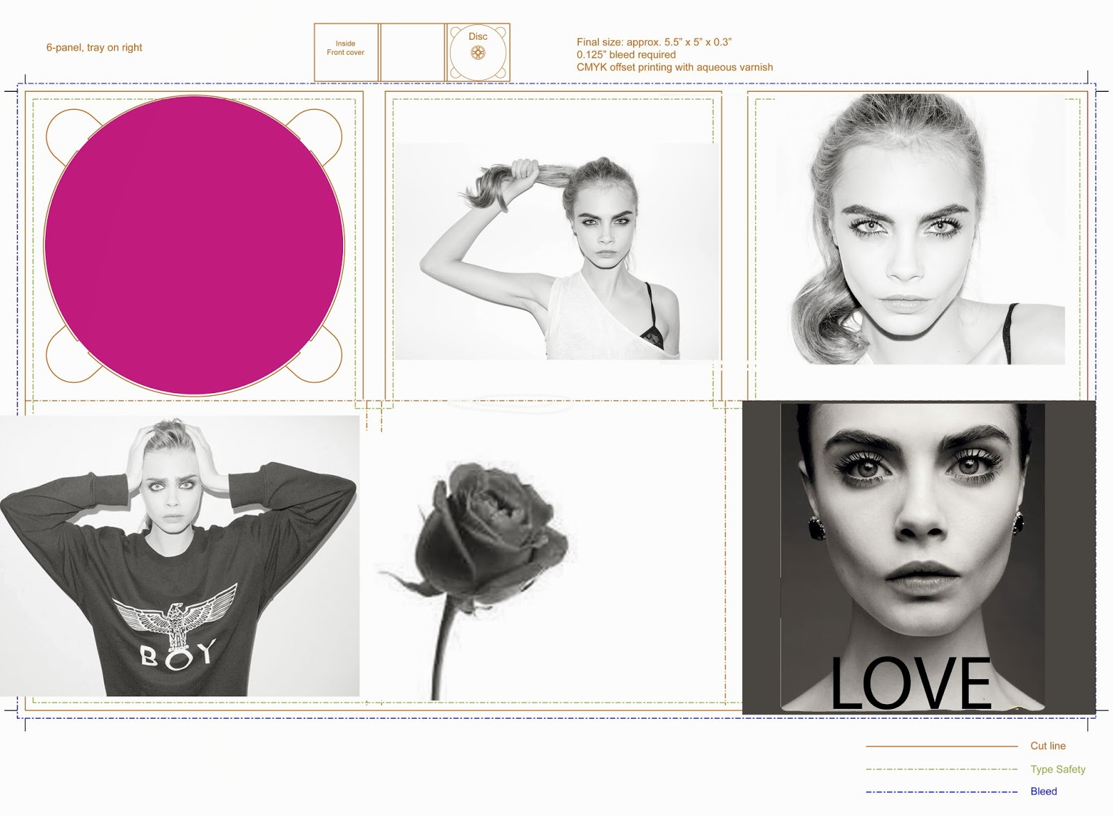
My album will be inspired by the album covers by Rihanna and Rita Ora. The music genre i will base my album cover on will be R&B, i will use a model to take photographs for the front cover and some of the inserts. I chose artists are my inspiration as they're both female, from the same genre and have a photograph on most of their album covers.
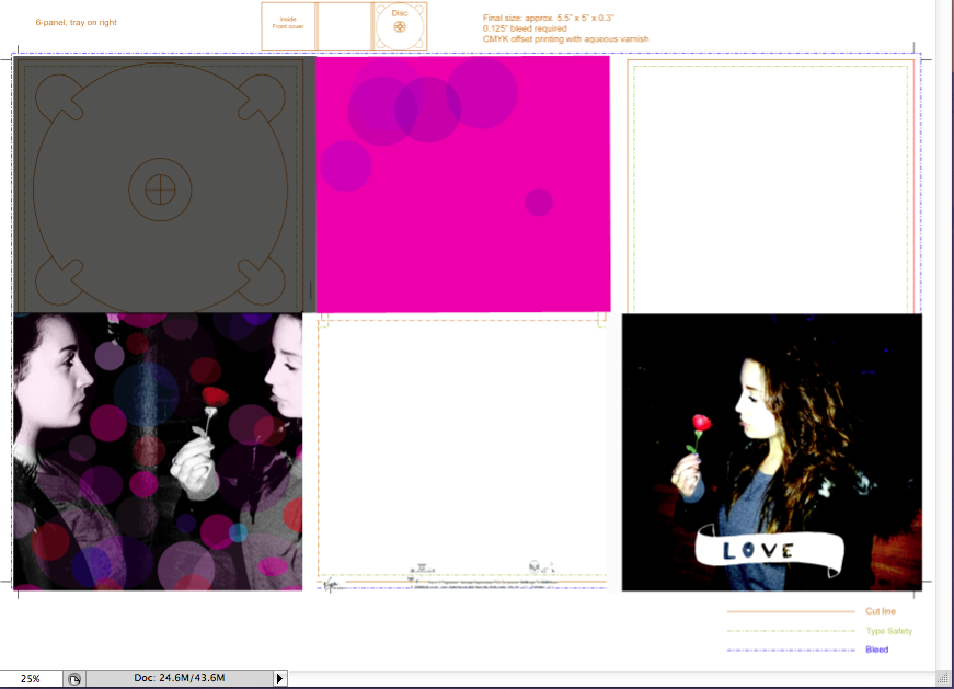
the name of the product im inspired by is called LOUD, this has inspired me to use the word ‘love’ as my album title. It will be short,snappy and bold, this will make it slip off the tongue and not be boring, this will also make it a lot easier to do the 3D font that i want to use. This will be very effective.My colour theme is going to be black and white but my title is going to be bright pink which will catch the eye and make the album stand out from the rest.
I will use a bold font to match my theme and the photograph i use of my model which i will take myself will be edited into black and white to give a great effect.
My album will be inspired by the album covers by Rihanna and Rita Ora. The music genre i will base my album cover on will be R&B, i will use a model to take photographs for the front cover and some of the inserts. I chose artists are my inspiration as they're both female, from the same genre and have a photograph on most of their album covers.
the name of the product im inspired by is called LOUD, this has inspired me to use the word ‘love’ as my album title. It will be short,snappy and bold, this will make it slip off the tongue and not be boring, this will also make it a lot easier to do the 3D font that i want to use. This will be very effective.My colour theme is going to be black and white but my title is going to be bright pink which will catch the eye and make the album stand out from the rest.
I will use a bold font to match my theme and the photograph i use of my model which i will take myself will be edited into black and white to give a great effect.
Monday 14 October 2013

Wednesday 9 October 2013
Monday 30 September 2013
Subscribe to:
Posts (Atom)